
Darrell Huff wrote ten short chapters in 1954. Seventy years later, India's administrative data illustrates each one almost perfectly. Here is a field guide — one chapter at a time, every idea paired with a real example, and a piece of good news hiding inside each warning.
There is a question that makes a fine opening for any data workshop. The new survey is out. Child stunting in your state is 28%. The national average is 29%. You are in charge. What do you do?
The honest first answer is: almost nothing useful — yet — because that single number has not told you where the problem is, who it touches, or what is causing it. Learning to get past that number is the whole craft of reading data well. And the friendliest teacher of that craft remains a slim paperback from 1954.
Darrell Huff was a journalist, not a statistician, and his little book How to Lie with Statistics is still the best-selling statistics book ever written — because it is built from stories, not formulae. It shows how perfectly true numbers can quietly tell untrue tales. Today, as we link India's administrative datasets together ("harmonisation") and point AI at them, that skill matters more than ever: these tools do not make numbers truer, they make them faster, tidier and more confident. So reading a number well has become a kind of superpower — and, happily, one anyone can learn.
Let us walk through Huff's ten chapters, one at a time. For each, three things: what the idea says, Huff's own example, and the Indian evidence that proves it — drawn from publicly available survey data such as the National Family Health Survey (NFHS) and the Annual Status of Education Report (ASER).
Chapter 1 — The Sample with the Built-in Bias
What it says. Every number begins as a sample — a slice of reality. If that slice is chosen in a lopsided way, no amount of careful arithmetic later can straighten it. The bias is baked in before you begin.
Huff's example. He reports that the Yale class of 1924 had an average income of $25,111 a year — a fortune at the time. The figure was nonsense, not because anyone lied, but because of who answered. The graduates the university could still find, and who were willing to state their income, were the visible and the prosperous. The poor, the drifting and the dead never returned the form. The sample chose itself, and it chose the rich.
The Indian evidence. Two everyday versions.
Who is in the data? A welfare roll includes only those who registered, had documents, and were reached. The people missing from it — the remote, the undocumented, the unreached — are missing in a patterned way, and they are usually the ones who need help most.
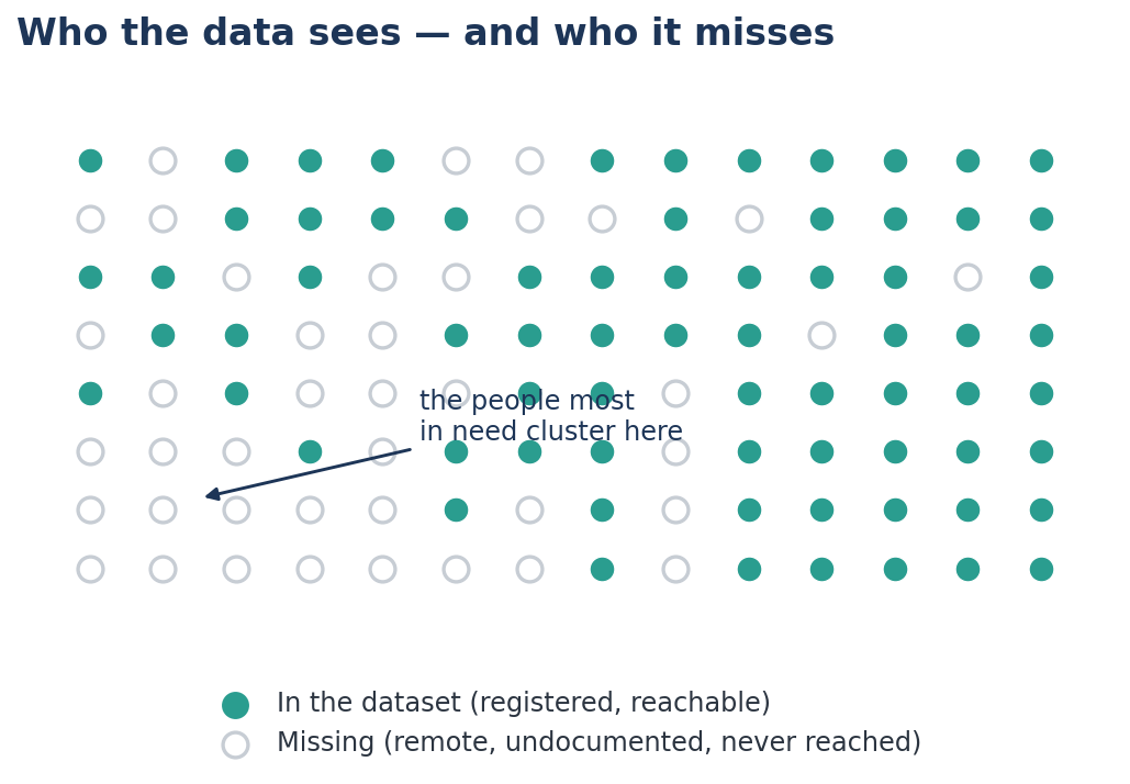
Who took up the programme? ASER data show that children in private schools in rural Bihar read better than those in government schools. Tempting to conclude that private schools teach better. But richer, more educated parents are far more likely to choose private schools — and to spend more time and money on their children at home. The two groups were never alike to begin with. This is selection bias, and it returns to haunt us in Chapter 8.
The AI twist, and the cheerful fix. When AI harmonises half a dozen biased rolls into one shining master database, it does not cancel the bias — it tidies it, into a confident portrait of exactly the people who were already easy to count. The fix is a habit, not a technology: ask, always and warmly, "Who is missing from this?" Naming the gap is the first step to closing it.
Chapter 2 — The Well-Chosen Average
What it says. "Average" is a coat that fits three different bodies — the mean, the median and the mode. Whoever picks which one you see has half-decided your conclusion. And an average taken across a whole population can bury enormous differences inside it.
Huff's example. A property developer describes a neighbourhood's "average" income. Quote the mean, and a few mansions at the end of the lane drag the figure up into respectability. Quote the median, and you find most families struggling. Same street, two honest numbers, opposite impressions.
The Indian evidence. Take child stunting in Maharashtra. The state-wide average is a not-alarming 29.5% — but that single figure blends very different realities, and on its own it would point you to entirely the wrong place to act.
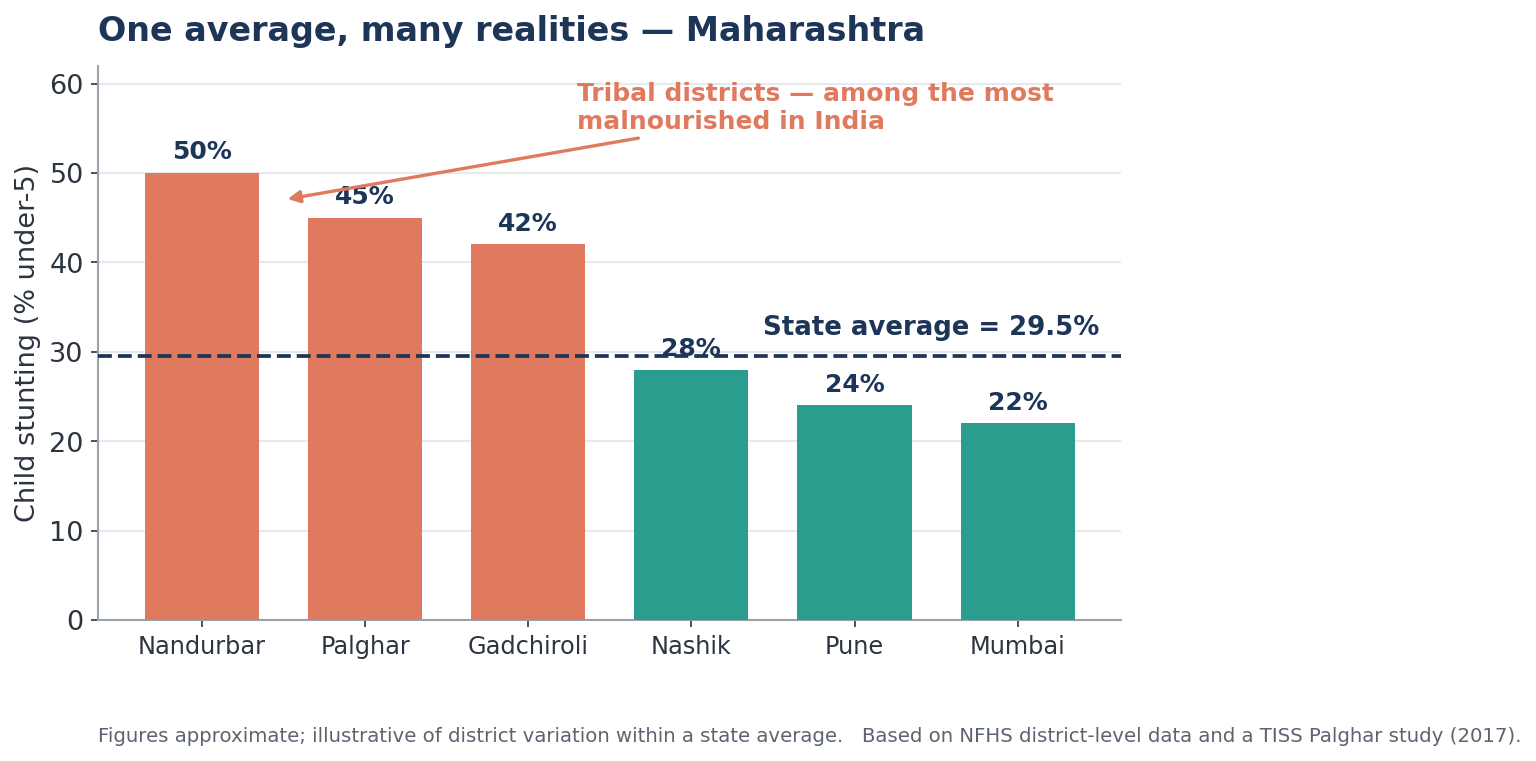
In tribal Nandurbar, about half of all children under five are stunted; Palghar and Gadchiroli are not far behind, with levels comparable to sub-Saharan Africa. Mumbai and Pune sit in the low twenties. The state average of 29.5% is not one problem. It is several very different situations averaged into a single number that shows none of them. The same pattern holds within the national figure: an Indian average of 29.3% stunting includes states ranging from the low twenties to above 34%.
The AI twist, and the cheerful fix. Ask an AI for "the state's stunting rate" and it will hand you the comfortable mean. The fix is to refuse the single number and ask disaggregate — by district, community, age. The detail isn't depressing; it is precisely where you can act.
Chapter 3 — The Little Figures That Are Not There
What it says. The most dangerous figures are the ones quietly left off the slide: the base, the sample size, the comparison, the margin of error. A percentage with no denominator is barely a fact at all.
Huff's example. A toothpaste advertisement boasts "23% fewer cavities." Fewer than what? Over how long? Among twelve people or twelve thousand? The missing figures are the trick.
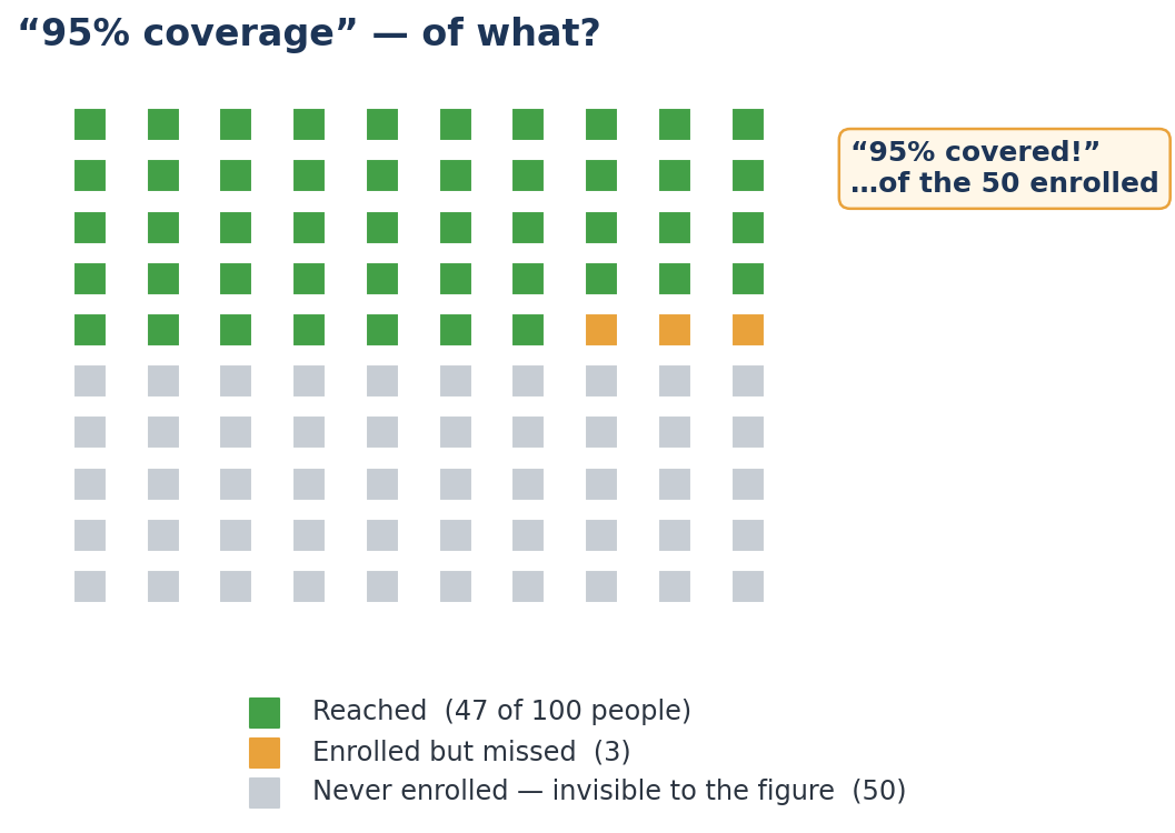
The Indian evidence. "95% coverage" is the slogan; "95% of what?" is the missing figure. Ninety-five per cent of those enrolled can still leave half the population untouched if enrolment itself was low.
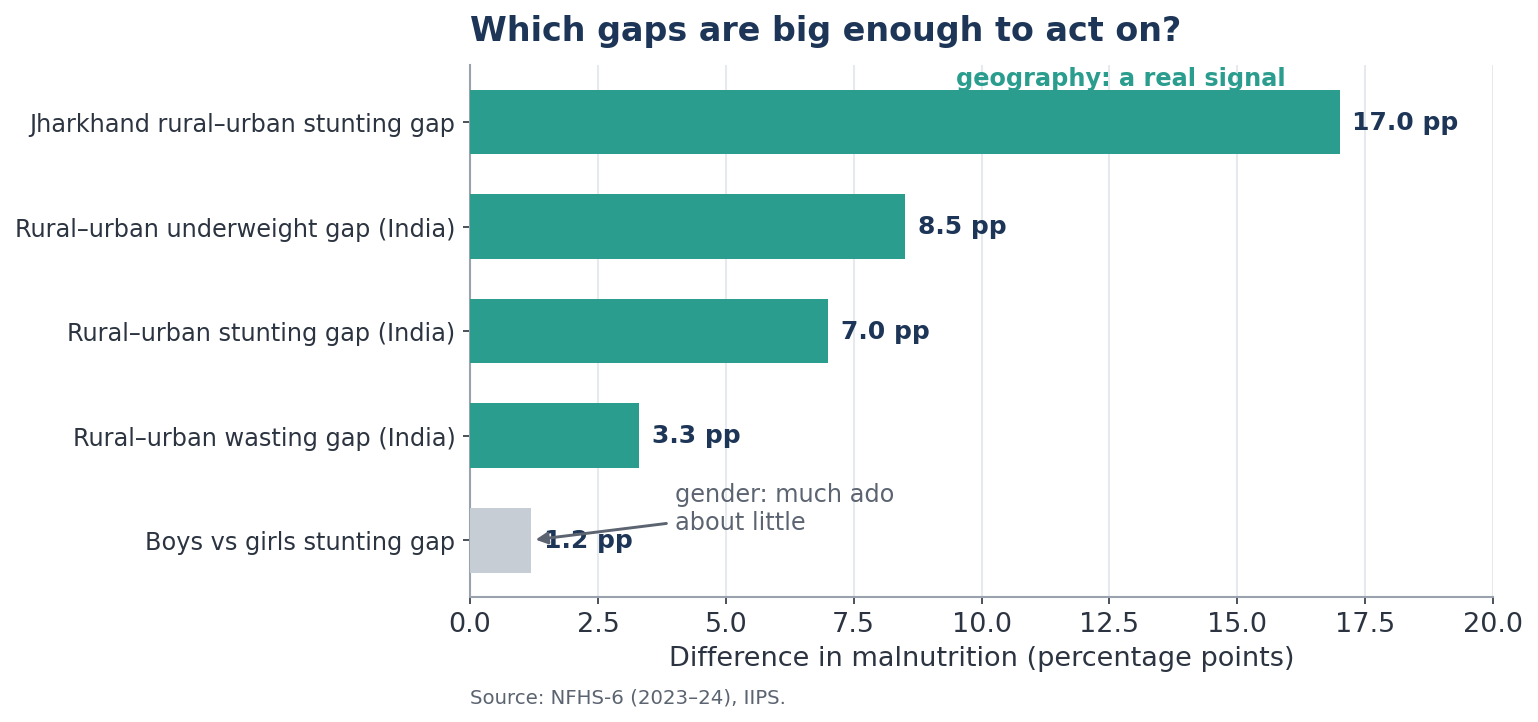
And the figures that appear once you go looking are often the whole story. The NFHS national rural–urban gaps are not on any headline tile, yet they are decisive: rural children carry 7 percentage points more stunting, 8.5 more underweight, and 3.3 more wasting than urban children. In Jharkhand, the rural–urban stunting gap is a startling 17 points — nearly double the risk for a rural child. None of that is visible in "29.3%." It was simply not there until someone disaggregated.
The AI twist, and the cheerful fix. A model will report a number to as many decimals as you like and never volunteer what it omitted. So make omissions impossible to ignore: require every harmonised dataset to declare its base, its non-response, and its coverage gaps as a condition of use. Make the absent figures present.
Chapter 4 — Much Ado about Practically Nothing
What it says. Not every difference is a real difference. Measurements wobble; small gaps are often just noise. Treating a tiny, meaningless difference as if it mattered wastes energy and invites bad decisions.
Huff's example. Two children scored 99 and 101 on an IQ test. Given the test's own margin of error, the "two-point gap" is meaningless — yet parents and schools will solemnly act on it. Much ado about practically nothing.
The Indian evidence. When you disaggregate child malnutrition, some cuts reveal a roaring signal and others a whisper. Geography shouts: the rural–urban and state-to-state gaps run to 7, 8, even 17 points. Gender barely murmurs: boys are marginally more malnourished than girls, by around a point, too small to drive a targeting strategy.
This is exactly why a sound rule is "do not disaggregate by everything." Slice the data a hundred ways, and the machine will always find some difference — most of them noise. The implication for targeting is clean: let geography and location lead; let gender refine within those groups, not drive them.
The AI twist, and the cheerful fix. AI will cheerfully surface thousands of tiny differences every cycle, each of which looks actionable. The fix is to ask, before acting, "Is this gap big enough — and steady enough — to be real?" A system that chases every wiggle chases ghosts.
Chapter 5 — The Gee-Whiz Graph
What it says. The same numbers can look like a cliff or a calm plain, depending only on where the chart's bottom begins. Chop the axis, and a trickle becomes a torrent.
Huff's example. A modest rise — a few per cent — is drawn first on a normal axis (a gentle slope) and then with the bottom lopped off (a dramatic, soaring line). Same data; utterly different feeling.
The Indian evidence. Picture a scheme's coverage inching from 71% to 73% over five years.
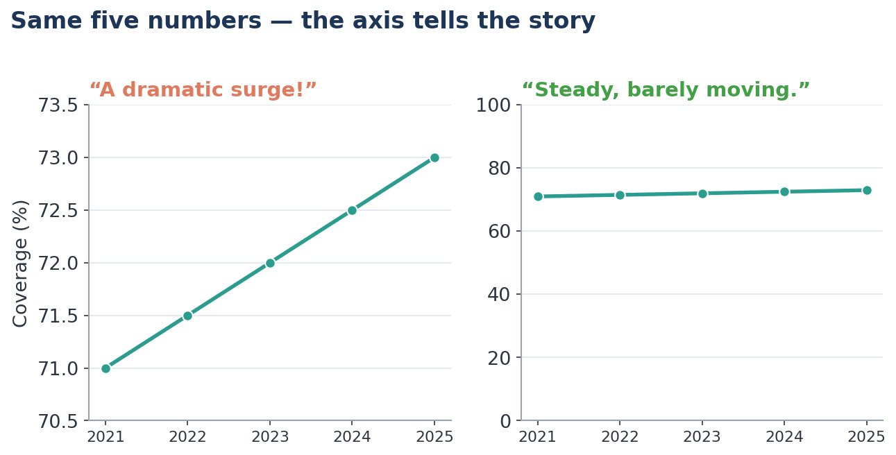
This matters enormously on any dashboard, where a chart is taken in at a glance before a decision, and where the choice of axis quietly shapes the impression it leaves. (It cuts both ways: a sound data-validation habit is to treat a number that changes too dramatically — a rate "rapidly declining" between rounds — as a prompt to re-check the data, not only as a cause to celebrate.)
The AI twist, and the cheerful fix. Once you know to flick your eyes to the axis, no chart can fool you again — and we can simply agree, in the harmonisation rulebook, to draw honest axes by default.
Chapter 6 — The One-Dimensional Picture
What it says. When a quantity doubles and you draw the picture twice as tall — but also twice as wide — the eye reads the area, which has quadrupled. The image lies even though the height is "correct."
Huff's example. A pictograph compares two economies with money-bags. The richer one is drawn twice as tall, but, being also twice as wide, it covers four times the paper — and feels four or eight times bigger than the truth.
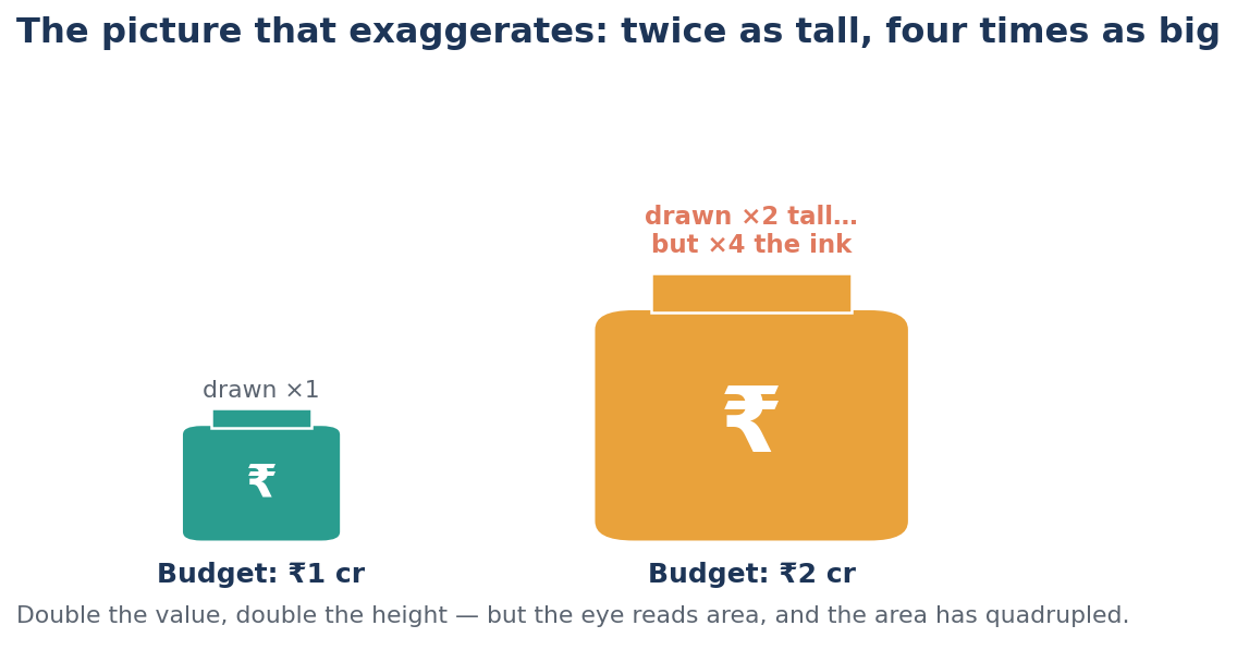
The Indian evidence. This is the one chapter with no neat survey example — but anyone who has sat through a glossy scheme presentation has encountered it: the giant rupee bag, the towering bar of "achievements," the infographic where one bubble dwarfs another for effect. The principle is Huff's, and it is worth naming aloud whenever a slide reaches for drama instead of proportion.
The AI twist, and the cheerful fix. AI image and slide tools make beautiful, dramatic infographics in seconds — which is exactly when to slow down and ask whether the size on the page matches the size in the data. Honest charts use one dimension — length — and let it tell the truth.
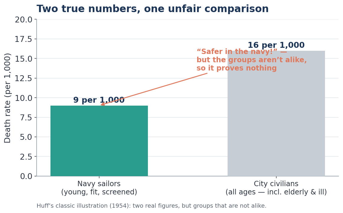
Chapter 7 — The Semiattached Figure
What it says. If you cannot prove what you want to prove, prove something else and present it as though it were the same thing. The two figures look attached; they are only semi-attached.
Huff's example. A recruiting pitch claims you are safer in the Navy than out of it, because the wartime Navy death rate (say, 9 per 1,000) was lower than a city's civilian rate (16 per 1,000). The catch: the Navy is full of screened, fit young men, while the civilian figure includes the elderly and the already ill. Two true numbers; an utterly unfair comparison.
The Indian evidence. The clearest everyday version is the gap between a means and an end. "We have linked the health and education databases" is a genuine and valuable technical achievement — but it is a different fact from "children are better fed and better taught." The linkage is the tool; the outcome is the goal; both are worth measuring, and they are not the same measurement. The semi-attached figure appears whenever a sentence slides from the thing that was built to the thing we hope it produced. The remedy is cheerful and simple: celebrate the linkage as a linkage, and then measure the outcome separately and honestly.
The AI twist, and the cheerful fix. AI is superb at producing the impressive-looking proxy — a matched dataset, a coverage number, a dashboard — and letting it stand in for the outcome we actually care about. The fix is one question: "Is the thing you measured the same as the thing you're claiming?"
Chapter 8 — Post Hoc Rides Again
What it says. Two things moving together do not mean one caused the other. There may be a hidden third factor lifting both; the causation may run backwards; or it may be pure coincidence. This is the chapter that matters most in policy work — and the one where modern methods help most.
Huff's example. Over a century, the salaries of clergymen and the price of rum rose together. Nobody seriously believes the vicars were drinking the difference; a third force — the general rise in prices — lifted both.
The Indian evidence — three layers, each deeper than the last.
(a) The hidden third factor. ASER data shows districts with better mid-day-meal coverage have higher reading scores — a 19-point gap. Tempting chain: more meals → better attendance → better nutrition → better learning.
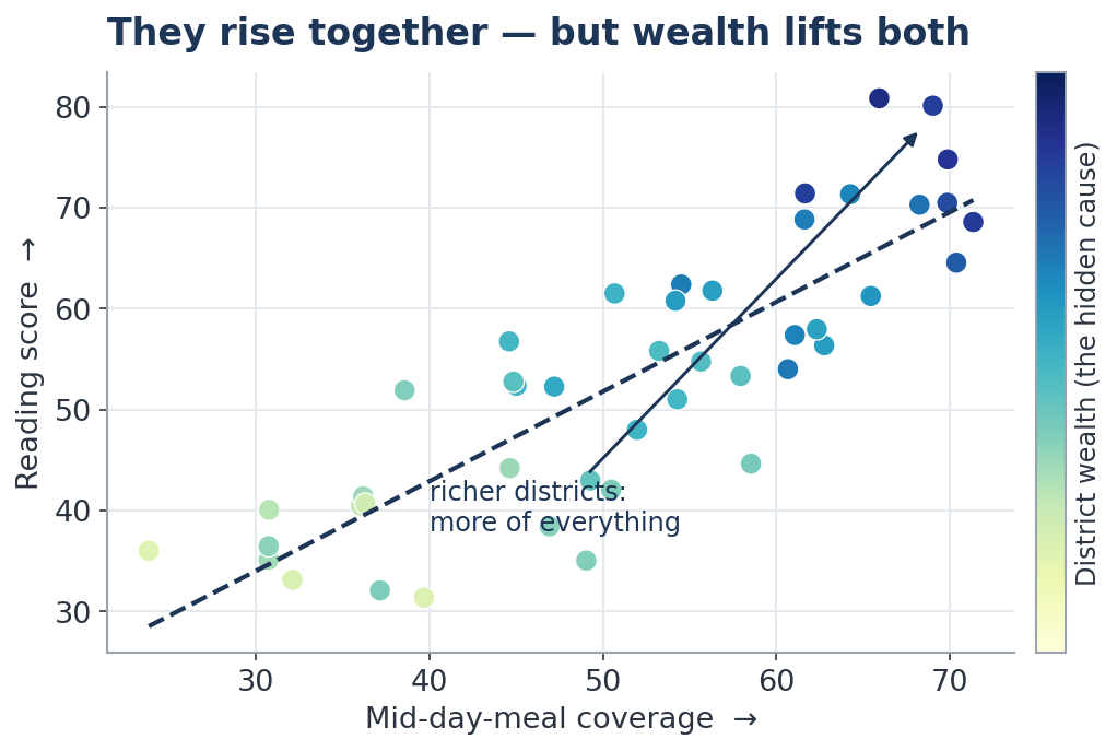
But the districts with good meals also have present teachers, working classrooms, richer households and more educated parents. Wealth and good administration lift both meals and learning.
(b) What controlling for the visible can — and cannot — do. We can statistically "hold constant" the factors we can see (teacher attendance, infrastructure, income, parental education). Do that, and the 19-point gap shrinks to about 9. Half of it was never the meal at all.
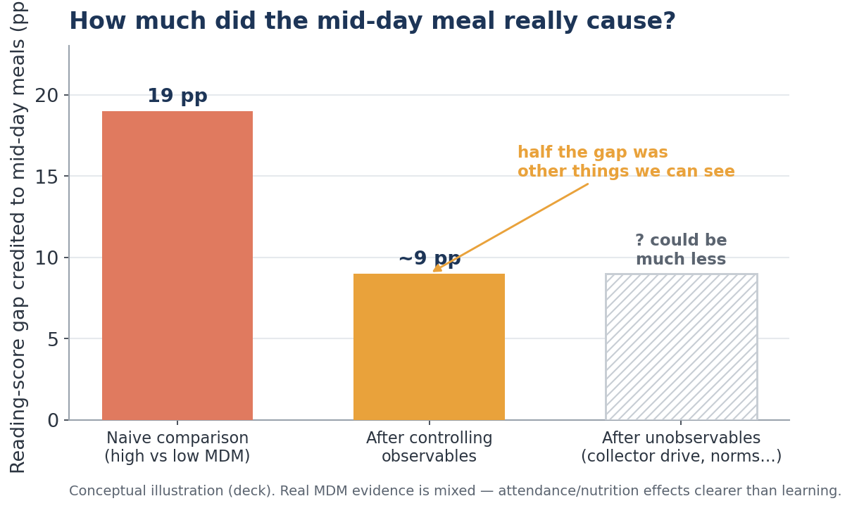
The remaining 9 points may still not be the meal. A district's truly decisive ingredients — a driven Collector, a community that prizes schooling, sustained political attention — are in no dataset. Regression removes the confounders you can observe; the unobservable ones remain. (Honest footnote: India's actual mid-day-meal evidence is genuinely mixed — clearer effects on attendance and nutrition than on learning.)
(c) The counterfactual mindset — the real cure. The deepest idea in evaluation is this: a programme's true impact is the outcome with it minus the outcome that would have happened anyway — the counterfactual. That second figure never exists; it must be carefully constructed.
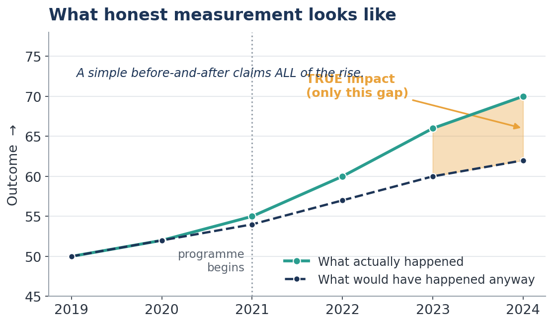
A training programme raised participants' income from ₹15,000 to ₹19,000. Impact? Not necessarily — the economy may have lifted, firms may have raised pay, people may have found jobs regardless. A "before-and-after" comparison overstates impact when good things happen alongside (a boom), and understates it when bad things do (a flood). Before-and-after is only safe when little else could have changed — a short window, or an outcome unlikely to move on its own (teaching illiterate adults to read where no other programme exists).
A classic evaluation trap is selection bias again, at scale. Take PMGSY, which connected over 1.7 lakh habitations. Connected villages earn more — so roads cause prosperity? Not so fast: the rule gave roads first to villages above a population threshold (1,000 in the plains; 500 in hills and tribal areas), and larger villages were already richer, better-connected and better-served. The income gap may reflect who got the road, not what the road did.
The elegant fix is regression discontinuity: compare villages just above the cut-off (998 people) with those just below (1,002). They are near-identical in every way but one — only the larger gets the road first — so the difference is close to a fair experiment. The careful study found PMGSY's effects were real but smaller than the naïve comparison claimed: workers shifting from farm to non-farm work, and a rise in school enrolment, especially for girls.
A compact map of the whole toolkit, worth pinning to a wall:
| Method | The "counterfactual" it assumes | The key assumption |
|---|---|---|
| Before & after | The group before the programme | Nothing else changed during the programme |
| With & without | A group that didn't get it | The two groups are alike but for the programme |
| Difference-in-differences | Control group's before→after change | Both groups would have moved in parallel anyway |
| Regression | Comparison group, with factors held constant | The controls are the onlyway the groups differ |
| Regression discontinuity | Those who just missed the cut-off | The cut-off was followed and not gamed |
| Randomised controlled trial | A randomly assigned comparison group | Randomisation balances everything, seen and unseen |
Difference-in-differences deserves a line of its own, because it is so usable. A reading programme ran in Jehanabad, Bihar, but not in neighbouring Buxar. Buxar's own before→after change estimates "what would have happened anyway" in Jehanabad too; subtract it, and you cancel out floods, policies and trends common to both — provided the two would have moved in parallel without the programme. And the RCT is the purest of all: assign people to programme-or-not at random, and the two groups end up alike on everything — educated parents, rich families, hidden motivation — so any later difference is the programme's.
The AI twist, and the cheerful fix. Once every dataset is linked, AI will mint spurious correlations faster than anyone can check them. But this is also where AI is a genuine ally — it can run the disaggregation, the controls, the difference-in-differences, in seconds. The fix is a mindset, not a model: treat every pattern as an exciting question, and ask "what would have happened anyway?" before claiming a win.
Chapter 9 — How to Statisticulate
What it says. Huff's word for mischief done with honest-looking arithmetic — false precision, switched bases, "percent" muddled with "percentage points," the hypnotic authority of a decimal place.
Huff's example. A figure reported to several decimal places radiates a precision the underlying measurement never possessed. Decimals feel like rigour; often they are decoration.
The Indian evidence. Two flavours.
Definitions quietly switching. In routine reporting, figures often go wrong not from bad maths but from muddled meaning. A form asks for "take-home ration given for 15 days," and different people read it differently — some record the days supplied, others the days on which it was distributed. A field asks for the number of women given a full course of tablets, and a few enter the number of tablets instead. The arithmetic is flawless; the figure is still wrong, because the question silently changed. The cure is design, not blame: clearer definitions, a shared data dictionary, and simpler forms.
The dazzle of false precision — now wearing an AI badge.
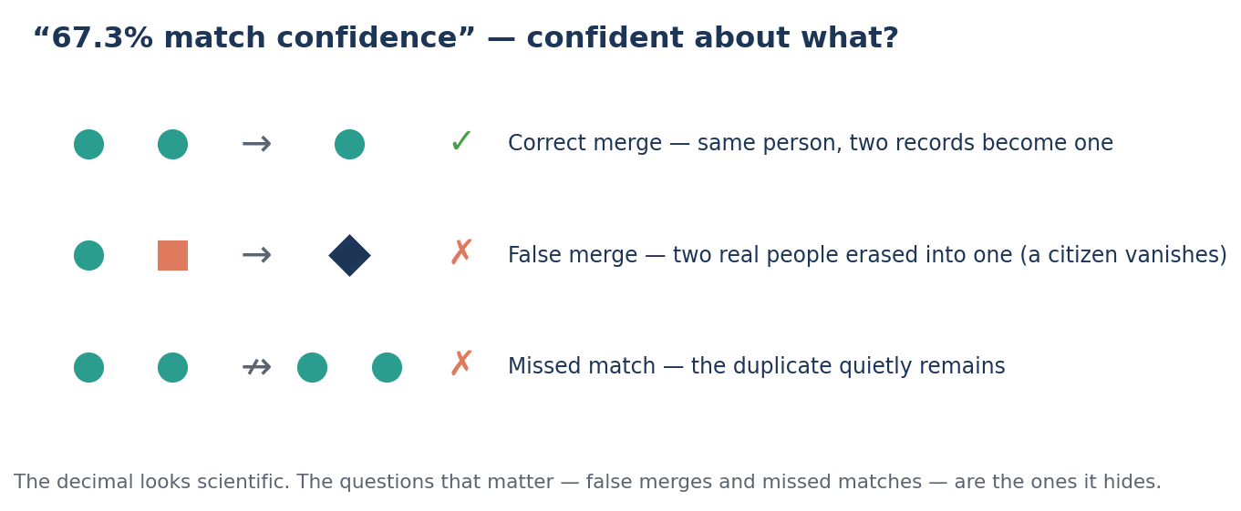
When a deduplication tool announces "67.3% match confidence" or "1.24 million duplicates removed," the decimals do the persuading. But the figures that matter are the ones it does not show: how many real, distinct people were wrongly merged into a single record — quietly dropping a genuine person from the list — and how many true duplicates slipped through. Precise is not the same as accurate.
The AI twist, and the cheerful fix. AI will always offer more decimal places than the data can support. The fix is to treat confidence scores as claims to be checked, not facts: ask for the error rates behind the precision. Happily, those are perfectly checkable.
Chapter 10 — How to Talk Back to a Statistic
What it says. Huff ends not with despair but with a toolkit: five plain questions that disarm almost any misleading number. They take about ten seconds.
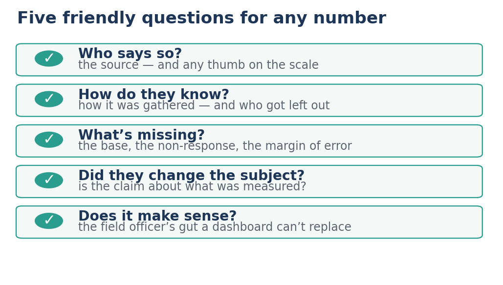
- Who says so? — the source, and any thumb on the scale.
- How do they know? — how it was gathered, and who got left out.
- What's missing? — the base, the non-response, the margin of error.
- Did they change the subject? — is the claim really about what was measured?
- Does it make sense? — the field officer's gut that no dashboard can replace.
The Indian evidence — the five questions in action. A particularly clean worked example is a model of "talking back," and it pairs beautifully with a single discipline: if my hypothesis were true, what should I see in the data?
Take Meghalaya, which has the highest child stunting in India at 36.8%. The natural first hypothesis: malnourished mothers. So we predict what the data should show if that were true — and check, four ways.
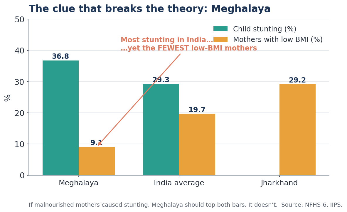
- Across states: Meghalaya should have among the worst maternal nutrition. It has the best — only 9.1% of mothers have low BMI, against an India average of 19.7% and Jharkhand's 29.2%. ✗
- Over time: stunting fell 9.7 points between rounds, but maternal low-BMI barely moved (1.7 points). The lines don't track. ✗
- Within the state: urban Meghalaya's mothers are very well-nourished (5.4% low BMI), yet 26% of their children are still stunted. ✗
- Mechanism: the usual risk markers are absent — iron-tablet uptake (62.7%) and early breastfeeding (76.4%) are better than the India average. ✗
Four tests, four failures. The hypothesis is wrong — and knowing it is wrong is real progress, because it stops the state pouring years into the wrong lever and points to the next candidate (food diversity, geographic access, cultural feeding practices).
The discipline cuts the other way, too. In Rajasthan — India's highest post-primary dropout rate, nearly twice the national average — a tempting explanation was the lack of girls' toilets. But the data refused to cooperate: Rajasthan actually had more schools with girls' toilets than the national average; over time, dropouts and toilets moved in the wrong direction together; and villages with toilets showed no significant dropout advantage over those without. Hypothesis weakened, sensibly set aside. When the same method was turned on complementary feeding as a cause of Rajasthan's stunting, every test strengthened it — Rajasthan ranks last on adequate infant diet (8.7% vs India's 15.3%), the rural diet gap matches the rural stunting gap, and the failure is precise to the 6–23-month window. A clean "yes," earned the same way the "no"s were.
A final discipline: know where the data is born. Many numbers are settled long before any AI sees them, simply in how they are first recorded. Self-reported answers tend to drift toward what sounds acceptable; manual measurements drift when instruments or training fall short. Some errors consistently overstate and some consistently understate — a weighing scale set a little high, a recall question answered from memory. None of this implies bad faith; it is simply how all manually collected data behaves, everywhere. The remedies are constructive and well known: align the incentives of whoever records the data, keep instruments and training in good order, audit gently, and simplify the forms. And this is where AI genuinely shines — the tireless validation checks: range checks (a child's age cannot be 200), logical consistency (breastfed newborns cannot exceed live births), and outlier and trend spotting (for instance, a centre reporting the identical number every month).
The happy ending
Notice the shape of all ten chapters. Each warning has a matching, cheerful fix — and most of those fixes are now easier, not harder, in the age of AI:
- The average that hides → disaggregate, which AI does in seconds.
- The missing figures → demand the base, and have AI flag its absence automatically.
- The tiny difference → test whether it's real before acting.
- The false cause → build a counterfactual, which AI can help estimate.
- The dazzling decimal → ask for the error rate behind the confidence.
The very tool that could spread an error a million times is also the most tireless fact-checker we have ever had. Point it at catching mistakes, and it becomes our ally.
We are about to have more data, and more powerful tools, than any administration in history. That is genuinely thrilling. Huff's five small questions — and the one discipline beneath them, if this were true, what should I see in the data? — are how we make sure all that power lands where it should: as better roads, healthier children, fuller classrooms, on the way to Viksit Uttarakhand@2047.
More data alone won't take us there. Data we can trust will — and trustworthy data begins, every time, with a single friendly, curious question.
Suggested reading: Darrell Huff, How to Lie with Statistics (1954). The Indian examples of disaggregation, diagnosis and impact draw on publicly available data from the National Family Health Survey (NFHS) and ASER; the PMGSY analysis follows Asher & Novosad (2020), American Economic Review.
